/ is the first page after sign-in.
Layout
Four panels below a row of metric tiles:- Case Activity — cases processed over the selected period.
- Risk Distribution — today’s cases by risk level, with counts and a share bar.
- Pending Queue — the cases awaiting review, with a View All link to the Decision Queue.
- Data Sources — the health of the connected providers.
Case Activity and the period selector
Today, 7 Days and 30 Days change the Case Activity chart only. The other three panels always show current data.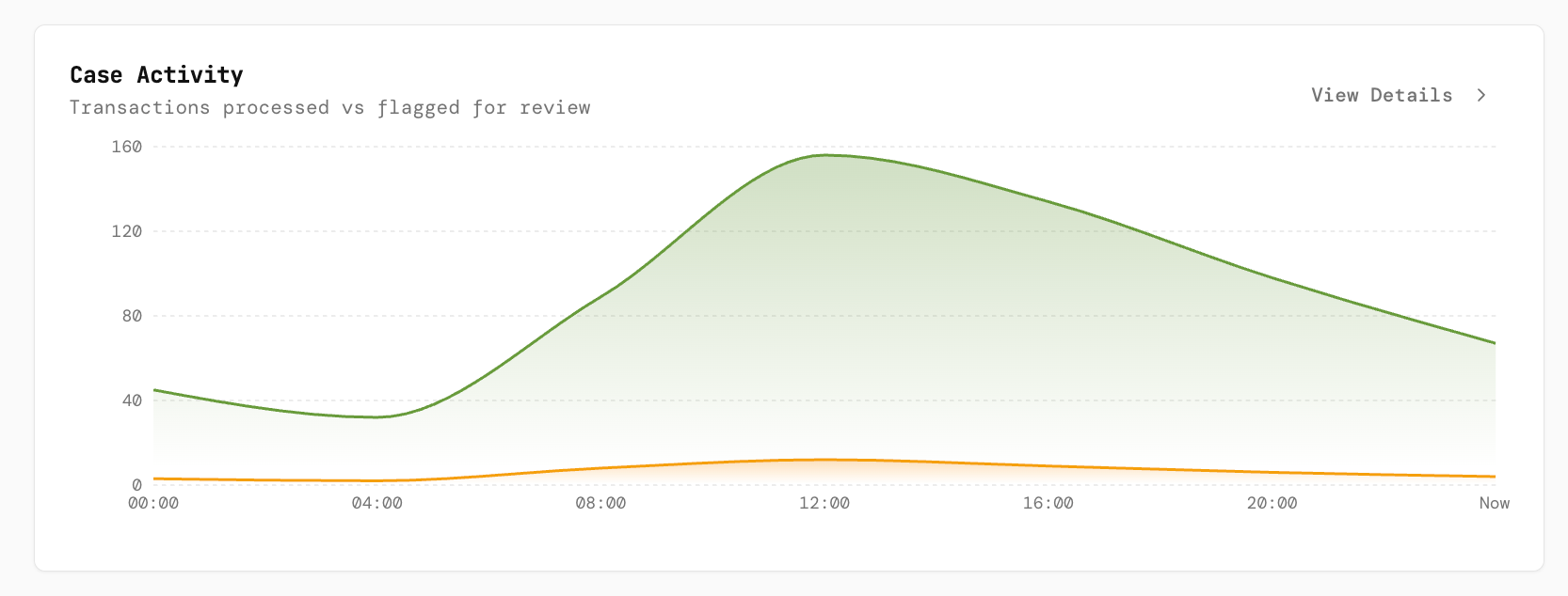
Case Activity: cases processed against cases flagged for review over the day.
Pending Queue and View All
The panel lists a handful of waiting cases with their risk badge, customer, case id, type, amount and status. View All opens the Decision Queue. Clicking a row opens the Decision Console on the first queued case.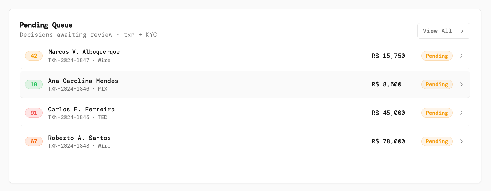
Pending Queue with View All.
Data Sources health
Each connected provider shows a status dot and latency. When a provider is degraded or disconnected, the panel adds a needs attention warning. The panel needsdatasources:read; on the analyst template it stays empty. Analysts cannot change providers; tell an engineer.
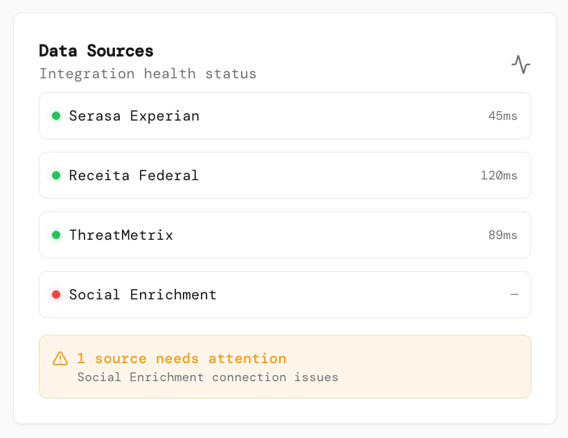
Provider health at a glance; one source needs attention.
Metric tiles
Not available today. The four tiles Pending Review, Approved Today, Declined Today and Avg. Decision Time, and the Detection Rate and False Positive Rate figures under Risk Distribution, show a dash: nothing populates them yet.